Button
The button control is the primary element for user interaction.
Quick Start
#include <wui/control/button.hpp>

// Simple text button
auto btn = std::make_shared<wui::button>("Click me", []() {
    std::cout << "Button clicked!" << std::endl;
});
window->add_control(btn, {10, 10, 100, 30});

// Button with image
auto img_btn = std::make_shared<wui::button>("Save", []() {
    save_document();
}, wui::button_view::image_right_text, "res/save.png", 16);
window->add_control(img_btn, {10, 50, 100, 80});
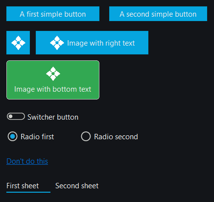
Button Views
enum class button_view
{
    text,              // Text button
    image,             // Image only
    image_right_text,  // Image to the right of text
    image_bottom_text, // Image below text
    switcher,          // Toggle switch
    radio,             // Radio button
    anchor,            // Link
    sheet,             // Sheet button
    checkbox           // Classic checkbox
};
Toggle or classic checkbox
switcher is a pill-shaped toggle; checkbox is a square with a check mark.
Both update turned() before invoking the click callback, for mouse and keyboard
activation. turn(bool) changes state without calling the callback.
auto check = std::make_shared<wui::button>("Remember choice", [] {},
    wui::button_view::checkbox);
check->turn(true);
window->add_control(check, {20, 60, 240, 94});
// Change presentation without resetting the checked state:
check->set_button_view(wui::button_view::switcher);
Switcher, checkbox and radio indicators are drawn with primitives, without PNG
resources. The optional indicator_size theme dimension specifies their height
in logical pixels; missing or zero uses the font size plus 4 (minimum 12).
The toggle is twice as wide. Colors use calm, active, text, disabled and
focused_border; the checked mark automatically contrasts with the fill.
Legacy button_switcher_* and button_radio_* images are no longer used.
API
Constructors
// Text button
button(std::string_view caption, std::function<void(void)> click_callback,
       std::string_view theme_control_name = tc,
       std::shared_ptr<i_theme> theme_ = nullptr);

// Button with view
button(std::string_view caption, std::function<void(void)> click_callback,
       button_view button_view_, std::string_view theme_control_name = tc,
       std::shared_ptr<i_theme> theme_ = nullptr);

// Button with image (Windows - from resource)
button(std::string_view caption, std::function<void(void)> click_callback,
       button_view button_view_, int32_t image_resource_index,
       int32_t image_size, std::string_view theme_control_name = tc,
       std::shared_ptr<i_theme> theme_ = nullptr);

// Button with image (from file)
button(std::string_view caption, std::function<void(void)> click_callback,
       button_view button_view_, std::string_view image_file_name,
       int32_t image_size, std::string_view theme_control_name = tc,
       std::shared_ptr<i_theme> theme_ = nullptr);

// Button with image (from data)
button(std::string_view caption, std::function<void(void)> click_callback,
       button_view button_view_, const std::vector<uint8_t> &image_data,
       int32_t image_size, std::string_view theme_control_name = tc,
       std::shared_ptr<i_theme> theme_ = nullptr);
Methods
// Set caption
void set_caption(std::string_view caption);

// Set view
void set_button_view(button_view button_view_);

// Set image
void set_image(int32_t resource_index);        // Windows
void set_image(std::string_view file_name);
void set_image(const std::vector<uint8_t> &image_data);

// Focus
void enable_focusing();
void disable_focusing();

// Toggle state
void turn(bool on);
bool turned() const;

// Callback
void set_callback(std::function<void(void)> click_callback);
Examples
Simple Button
auto ok_button = std::make_shared<wui::button>("OK", []() {
    std::cout << "OK pressed" << std::endl;
});
window->add_control(ok_button, {100, 100, 150, 130});
Toggle Button
auto toggle = std::make_shared<wui::button>("Enabled", []() {
    // Handle click
}, wui::button_view::switcher);

toggle->turn(true); // On by default
window->add_control(toggle, {10, 10, 100, 30});
Button with Icon
#ifdef _WIN32
auto save_btn = std::make_shared<wui::button>(
    "Save",
    []() { save_file(); },
    wui::button_view::image_right_text,
    IDI_SAVE_ICON,  // Resource ID
    16              // Size in pixels
);
#else
auto save_btn = std::make_shared<wui::button>(
    "Save",
    []() { save_file(); },
    wui::button_view::image_right_text,
    "res/icons/save.png",
    16
);
#endif

window->add_control(save_btn, {10, 50, 120, 80});
Theming
Button uses the following theme values:
{
  "type": "button",
  "calm": "#06a5df",
  "active": "#1aafe9",
  "disabled": "#a5a5a0",
  "border_width": 1,
  "round": 4,
  "font": {"name": "Segoe UI", "size": 18}
}